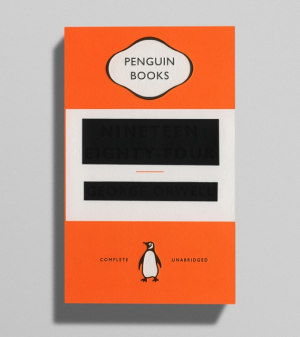
Love this cover art for the new Penguin edition of 1984.
[Designer David] Pearson says that the design went through numerous iterations "to establish just the right amount of print obliteration. Eventually we settled on printing and debossing, as per the Great Ideas series [Why I Write shown, above], with the difference being that the title and author name were then blocked out using matt black foil. This had the effect of partially flattening the debossed letters, leaving just enough of a dent for the title to be determined – though I can't vouch for it's success on Amazon

No comments:
Post a Comment